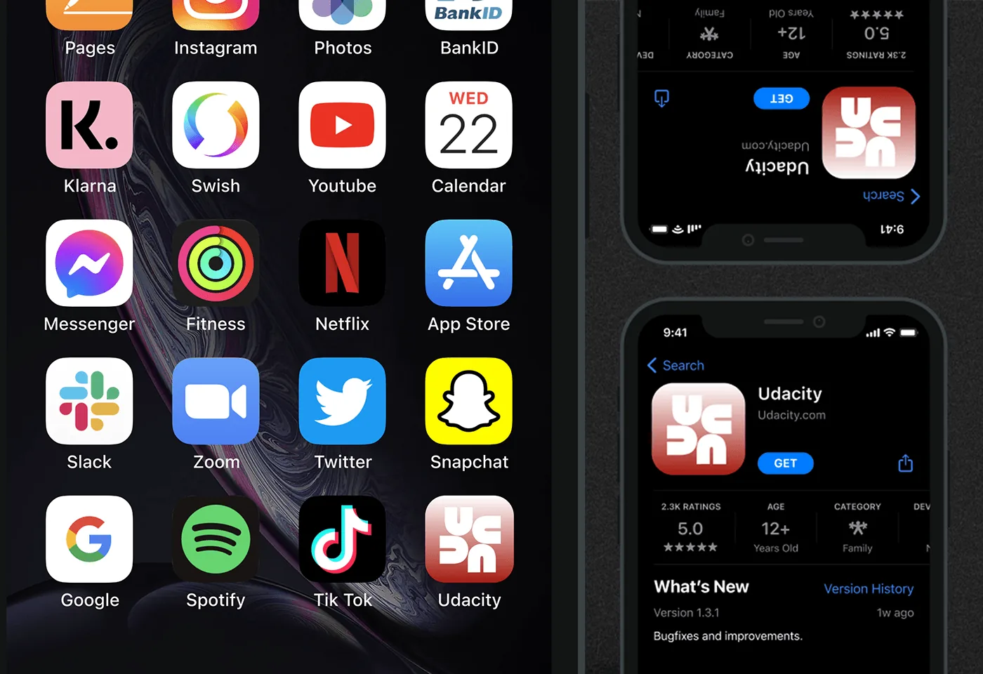
Udacity, reimagined
A self-directed concept: how Udacity's brand could speak to African learners, leading with culture, access and a sense of "you".

The idea
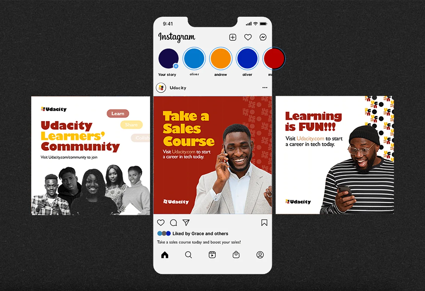
YOU-DACITY: a brand focused on YOU. This concept refreshes Udacity's brand for African learners, drawing on African culture, diversity and innovation. Udacity offers interactive online courses; here they are framed around the interests and needs of students, educators and lifelong learners across Africa.
My approach to this refresh is to present Udacity as a brand built on cultural authenticity, localised content, community, accessibility and empowerment, positioned to reshape online learning for African learners.

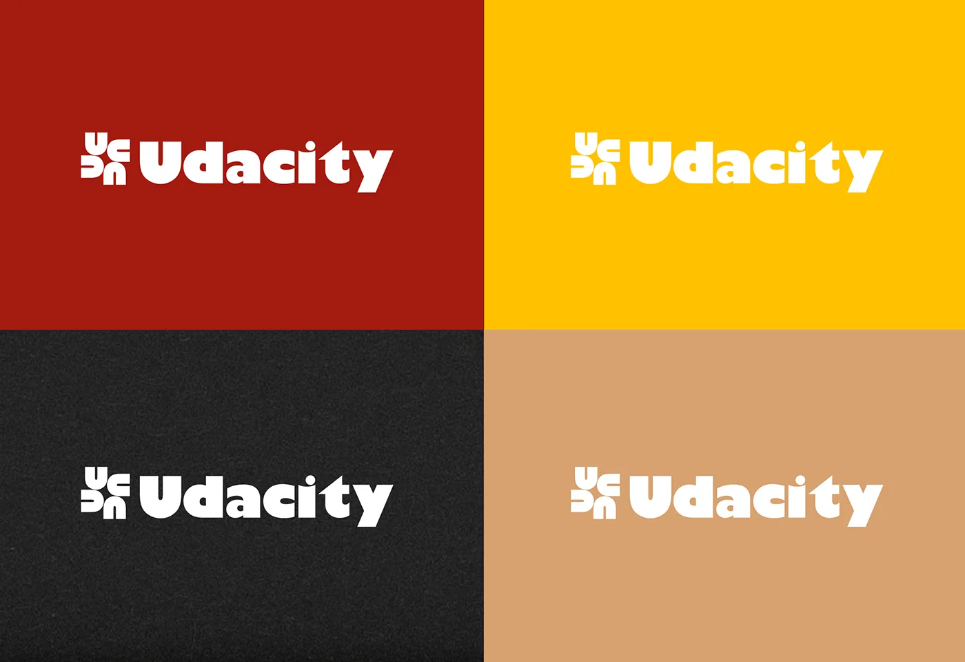
Logo Idea
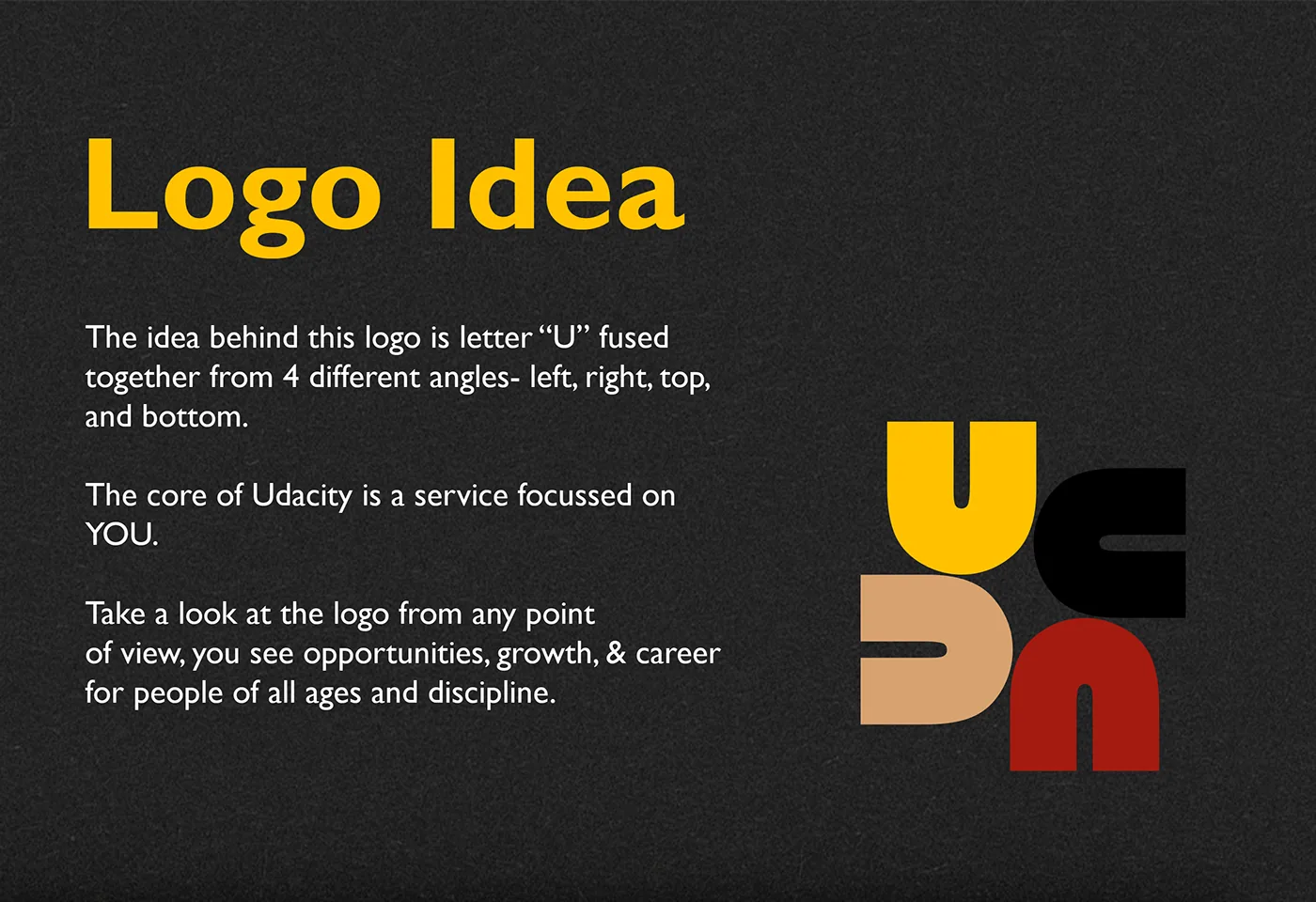
Look at the number "6" from the other side and you see a "9". The same idea drives the logo: look at Udacity from any side and you see a "U", a brand with opportunities for you, whatever your age or discipline.

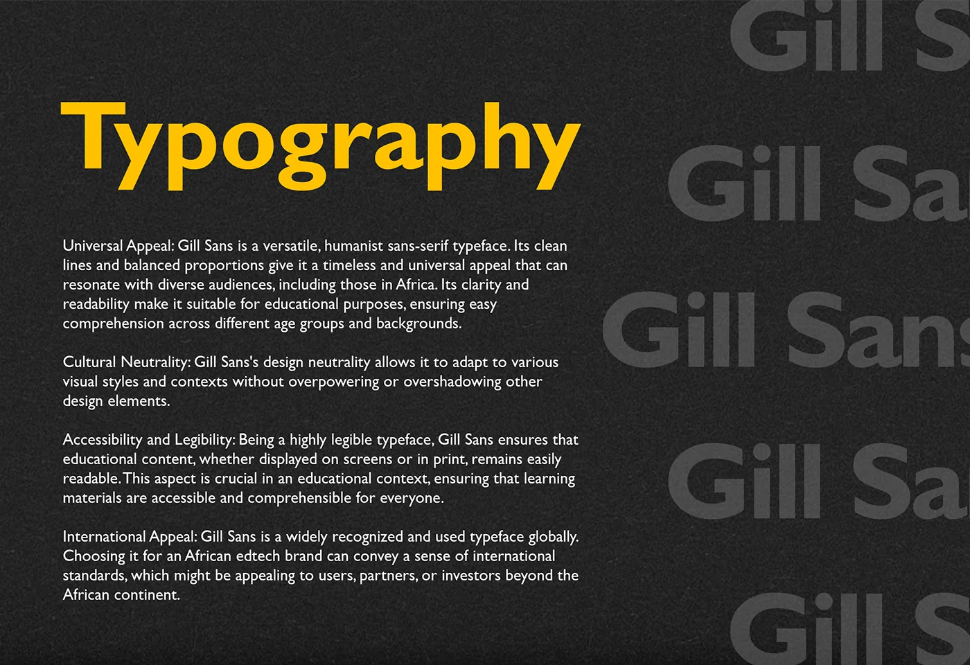
Typography
Gill Sans is a human-centered typeface that works well on screen, in print and across age groups. It also looks bold and ambitious.
Brand Pattern
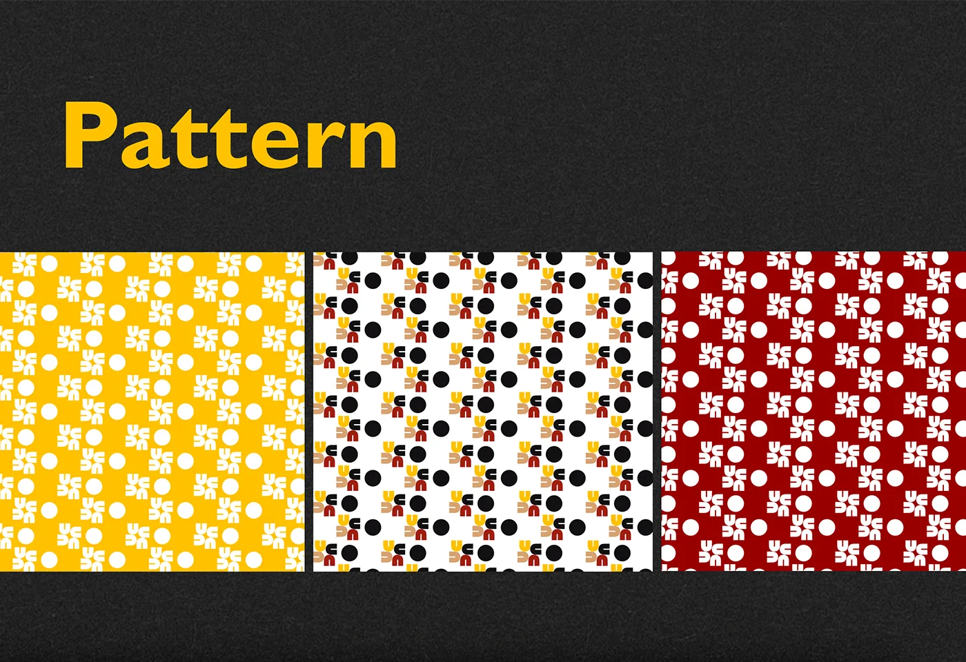
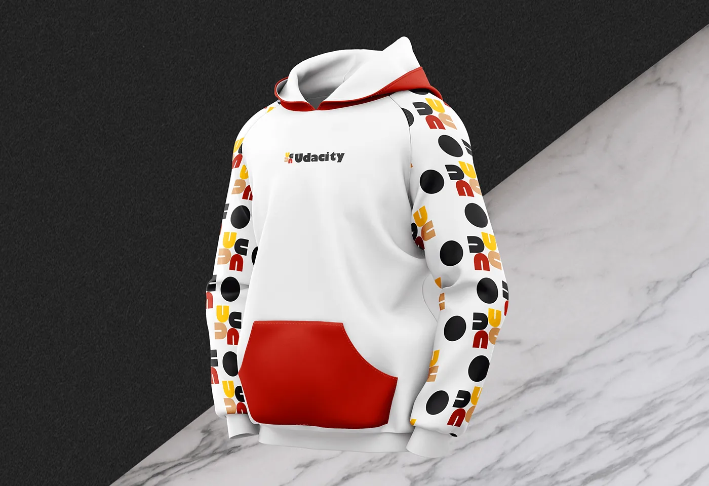
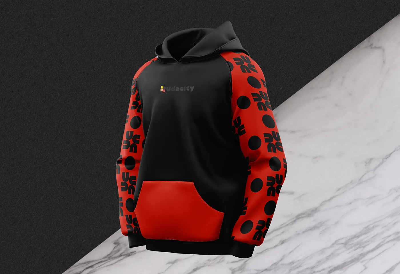
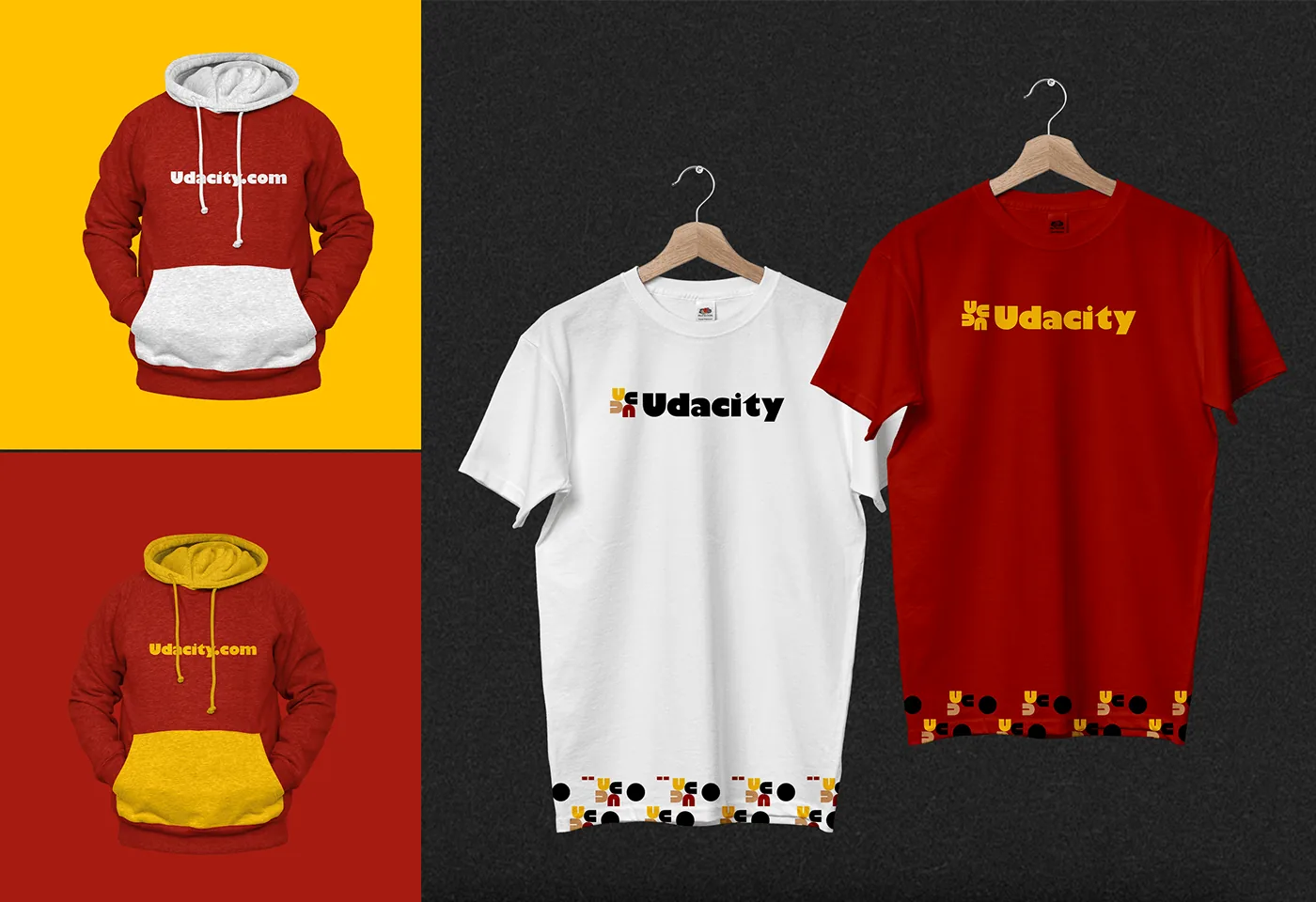
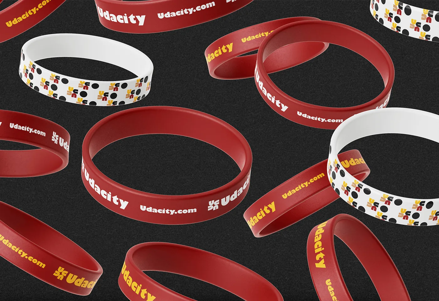
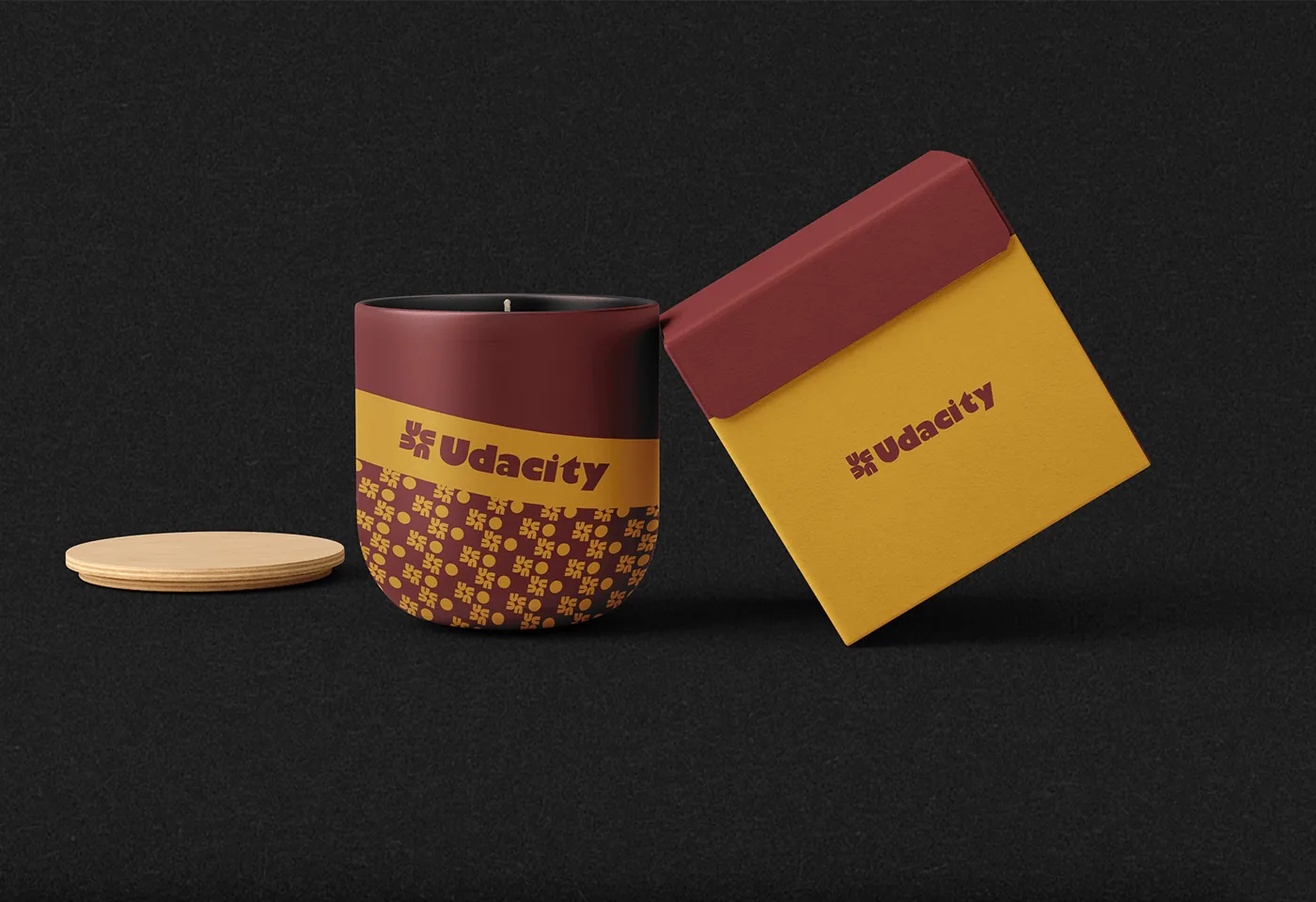
Pattern runs through African art and culture in bold colour and strong geometry: Ankara cloth in Nigeria, Maasai beadwork, mud cloth and Ndebele designs. These patterns carry stories, traditions and community, and work as a visual language that crosses boundaries. The pattern chosen for Udacity is Afro-centric, easy to recognise and pleasing to look at, and it would extend to merchandise and gift items for the brand.